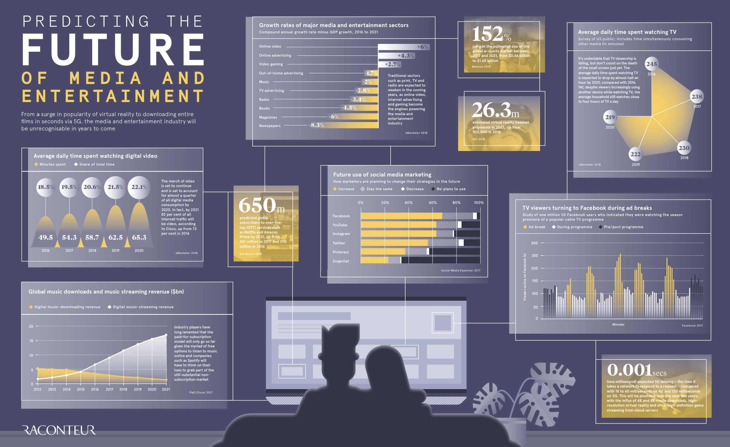
Since the beginning of the Industrial Revolution, the world has seen its population and the need for natural resources boom.
As more people and wealth translate into the demand for global goods, the prices of commodities—such as energy, agriculture, livestock, and metals—have often followed in sync.
This cycle, which tends to coincide with extended periods of industrialization and modernization, helps in telling a story of human development.
Why are Commodity Prices Cyclical?
Commodity prices go through extended periods during which prices are well above or below their long-term price trend. There are two types of swings in commodity prices: upswings and downswings.
Many economists believe that the upswing phase in super cycles results from a lag between unexpected, persistent, and positive trends to support commodity demand with slow-moving supply, such as the building of a new mine or planting a new crop. Eventually, as adequate supply becomes available and demand growth slows, the
 https://imageproxy.themaven.net/https%3A%2F%2Fs3-us-west-2.amazonaws.com%2Fmaven-user-photos%2Fmishtalk%2Feconomics%2FzmfATcSa4EegwR7v_znq6Q%2FInygtti8VkOkMC6cJ4kDng?w=962&q=30&h=581&auto=format&fit=crop&crop=focalpoint&fp-x=0.5&fp-y=0.5&fp-z=1&fp-debug=false 1.5x,